
With more and more users moving to mobile browsing and apps, it’s now more important than ever to create forms the right way if you want a user to input their data. That being said, most would say “It’s just an input form, right?” Well, not exactly. There are good mobile forms and bad ones, and following the mobile form design best practices is a good way to ensure yours is one of the good ones that people fill in happily.
With that in mind, here are some of the most important things to keep in mind if you want your users to enjoy the fields and forms you’ve designed for them and see eye to eye with your intentions. They’ll help you make some key decisions when it comes to forms, which is often underestimated feedback.
Use a Single Input Field
When it comes to mobile form design, using a form designed with multiple inputs is a bit of a pain. This is especially true when the user needs to switch between multiple input modes. And to make matters worse, using the keyboard might obscure part of the screen to the user’s eye, so a form that splits things into multiple fields without an actual need for that, is a bad idea.
A common example here is requiring a user’s name. Sure, from a marketing standpoint, having two separate fields for the person’s first and last name might sound like a good idea. But on the other hand, a single information form for the name is a better option because it saves time and is inclusive – not every culture has first and last names.
Keep Things Short
This isn’t just a mobile forms best practice, but rather one that applies whenever you have any type of design. No user wants to need to spend half an hour to complete an information form, especially because an app form requires a user to focus due to the small screen and font sizes.
If you absolutely must include a lot of things that take up time, make sure as many of them as possible are optional. You do have designers and developers that claim if an input is optional, it shouldn’t be there at all. However, designing apps isn’t an exact science, and in many cases, you want to do what works for you. Oh, and please, if you include something optional, mark it as so.
Now, in case you can’t cut down on any required information, nor can you make things optional, here’s another example– break it up in multiple screens. This way, the user isn’t scared away by a single screen of seemingly endless questions.
Communicate With Users
Any good UX designer will tell you that an overview of the system status is critical – the same applies to form design. You want every user to know whether or not the system has received what they’ve input, and whether or not it’s doing anything, and that should be done in a timely fashion. If it takes too long, the user might think the system isn’t doing anything and submit the form twice.
For example, to avoid just that, you can disable the primary submit button after the user has tapped it once. This lets them know that their form has been submitted, the process is complete, and they should wait for the system to do its thing now. And in turn, this will also prevent them from tapping it again and duplicating the submission.
And once the app does whatever it needs to do, let the user know that it’s complete. Whether that’s with an animation, new screen, or a popup – let them know everything is complete and their job is done.
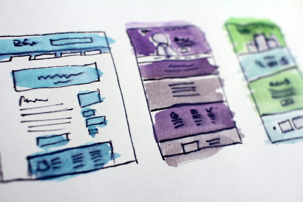
Keep Layout and Flow Logical For Forms
We already mentioned that the form UI should be designed to be as short as possible, but it should also be presentable and easy to use. A prototyping tool will go a long way towards allowing you to test out everything you do and optimize the layout as much as possible. You want it to be simple, reduce as much of the complexity as you can, and make it easier for users to fill out information – this will boost conversion rates. And here are a few things that will help with that.
- Keep the order of entry fields logical. Asking for someone’s age before you ask for their name, for example, is a bit weird (unless your app is age-restricted). Try to look at the form as a conversation, as this will keep a natural flow that lets the user deduce any questions they might not understand
- Only use a single-column layout. This kind of layout eliminates any kind of doubt on where the user should start, and in which order they are to continue. When you have an app form that has very little real estate to play with, this is even more important
- Group any similar fields. This goes a long way towards helping users understand questions – if they aren’t sure what a question is asking of them, they will usually look at the previous and next questions
Use Labels and Placeholders
If there’s one thing that helps immensely when it comes to having a user understand exactly what’s expected of them, it’s a placeholder or a label. It leaves zero room for any kind of interpretation, and it simplifies things by a lot, which is great in a situation where you have limited screen real estate.
Now, when using placeholders and labels, by all means, make sure they abide by the general guidelines – make them simple, make them helpful, and make sure they’re designed to be concise. Don’t use full sentences, keep them as short as possible.
And here’s another tip while we’re at it – make sure the labels are above the field itself, and very close to the field. This will make sure the label is still there when the user starts typing and guides the eye where the data needs to be input.